Nothing Phone 2’s upgraded Glyph Interface gives us more functionality compared to Nothing Phone 1.
The upcoming Nothing Phone 2 smartphone will feature an upgraded version of Nothing’s signature Glyph user interface, which is scheduled to be formally unveiled on July 11th. Marques Brownlee has uploaded an early hands-on video with the new smartphone to YouTube. The video provides a comprehensive look at the flashing light interface built into the back of the phone, as well as the changes that Nothing has made to it in comparison to the Phone 1 from the previous year.
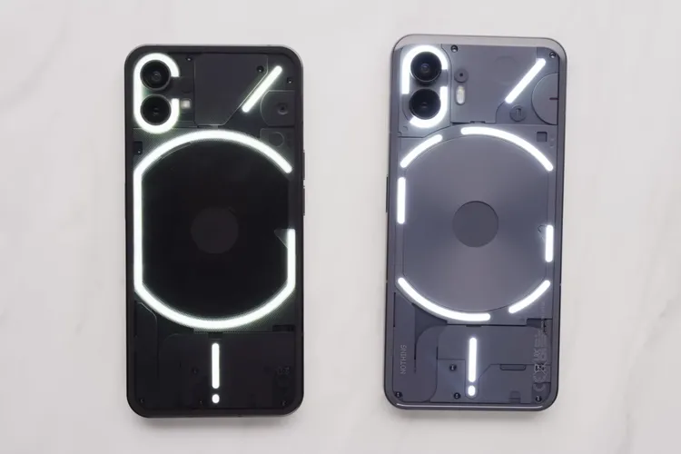
Even though it follows roughly the same pattern, the Glyph interface has been updated to include more zones of LED lighting, which should enable it to provide a finer level of control over the lighting effects on the phone. Nothing phone 2’s “Glyph Composer” allows users to create personalized ringtones and flashing light patterns based on synthesizer sounds. This time around, there are almost three times as many zones available, with 33 zones available on the Phone 2 as opposed to just 12 on the Phone 1.
Within the curved strip of light located on the upper right side of the back of the phone, more zones allow the device to display information such as the current volume level or the amount of time remaining on a timer. There are also plans to enable third-party applications to use this light strip as a progress bar, and apps like Uber and Zomato have already signed up to support it. The comic strips themselves are also broken up into more sections, despite maintaining a layout that is relatively similar to the one used previously.

Image: MKBHD
The light strips on the Phone 2 (pictured on the right) are segmented into a greater number of sections and incorporate an increased number of LEDs.
Another one of the brand new features is the capability to select an “essential app” and have the notifications from that app illuminate the light strip located on the upper right side of the back of the phone. Therefore, if you want the LED light on your Phone 2 to illuminate for notifications from WhatsApp but not for Gmail or Instagram, you should now be able to do that.
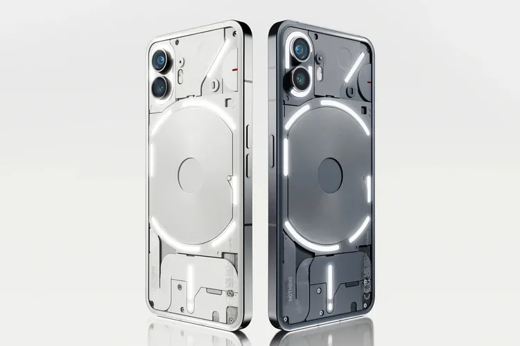
The fundamental design language of the Nothing Phone 1 has been carried over into the Nothing Phone 2, with only a few minor modifications. Brownlee notes that the back of the non-white variant has become somewhat more rounded this time around and that the colour of the non-white variant is now more grey than black. If you are interested in the white version, Nothing recently displayed it in a new promotional image uploaded to its website. We have included that image below for your viewing pleasure.
The white and grey versions of the Nothing Phone 2 are also available.
The information that can be gleaned from Brownlee’s video is extensive. Nothing has already been announced about the company’s upcoming Phone 2 in recent weeks, including the fact that it will come with a transparent USB-C cable, provide support for 3 years of Android updates and 4 years of security updates, and be powered by a Snapdragon 8 Plus Gen 1 processor. Importantly, unlike its predecessor, it will be marketed and sold in the United States.
Nothing Phone 2 Specs:
- Platform: Android 13, Snapdragon 8+ Gen1.
- Display: 6.67 inches, AMOLED.
- Camera: 50+48+8 MP and 16MP.
- Ram: 8/12GB.
- Memory: 128/256GB.
- Battery: 4700 mAh, Fast charging 80W.
If You want an in-depth review and full specification analysis as soon as Nothing Phone 2 releases, follow our social media, subscribe to our blog, or visit our review page constantly.


